TL;DR
-
-
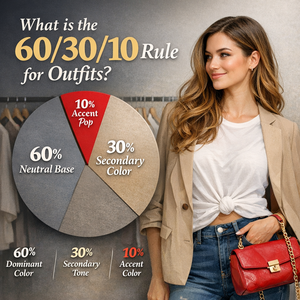
- The content explains the 60/30/10 rule for outfits: 60% dominant color/neutral, 30% secondary color/texture, 10% accent, to create cohesive, balanced looks.
- It applies this framework to Bella Gatti tees, detailing how to compose graphic tees with solids and textures, and how to coordinate colors across the collection.
- Practical guidance covers selecting base tones, layering with the 30% piece, and adding a focused 10% accent, with tips for logos, slogans, and patterns.
Table of Contents
What is the 60/30/10 Rule for Outfits
The 60/30/10 rule provides a clear framework for balanced outfits. It helps you avoid looks that feel chaotic or flat by establishing a simple three-part structure.
Split your ensemble into a dominant color, a secondary color, and a small accent. This setup makes outfits feel intentional and easy to assemble.
How to apply it in practice is straightforward. Pick one color or pattern to cover about 60 percent of your look, choose a second color or pattern for about 30 percent, and select a final accent for roughly 10 percent. Items can include clothing, shoes, bags, and prints, as long as the proportions stay clear.
Real-world example: pair a charcoal blazer (60 percent) with a white shirt and light gray trousers (30 percent), then add a crimson pocket square or belt (10 percent) for a pop of color.
use the rule as a planning tool. Start by identifying a neutral base, then layer a secondary shade for depth, and finish with a small, cohesive accent. For seasonal wardrobes, swap the 60 percent base with seasonally appropriate neutrals to maintain balance.
Common mistakes include over-stuffing the accent color or choosing two dominant colors that compete. If you see visual tension, shift the balance so the primary color reads at 60 percent and the secondary at 30 percent before adjusting the accent.
For guidance, look to established resources like Inside Out Style by Imogen Lamport. Bella Gatti US Shop recommends using their color coordination worksheets to map 60/30/10 layouts for tops, bottoms, and accessories, ensuring consistency across outfits.
Introduction
What the 60/30/10 rule is in fashion
The 60/30/10 rule provides a clear framework for color proportion. It designates 60% to a dominant color or neutral, 30% to a secondary color or texture, and 10% to an accent. This structure helps outfits feel cohesive and intentional. For example, pair a charcoal graphic tee with navy jeans and a mustard accessory for a balanced look.
How the rule helps create balanced outfits
Using 60/30/10 creates visual rhythm and reduces competing elements. The dominant hue anchors the outfit, the secondary shade adds depth, and the accent provides a deliberate focal point. In practice, wear a black tee with olive chinos and a burgundy belt to ground the look.
Why it matters for Bella Gatti US Shop apparel
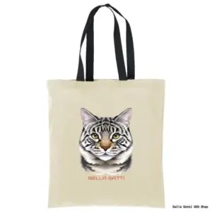
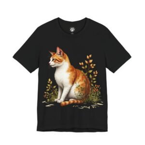
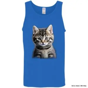
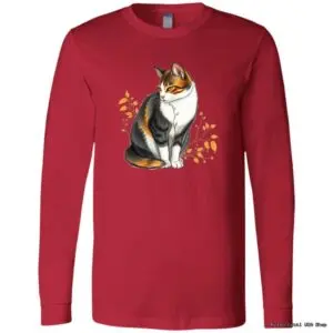
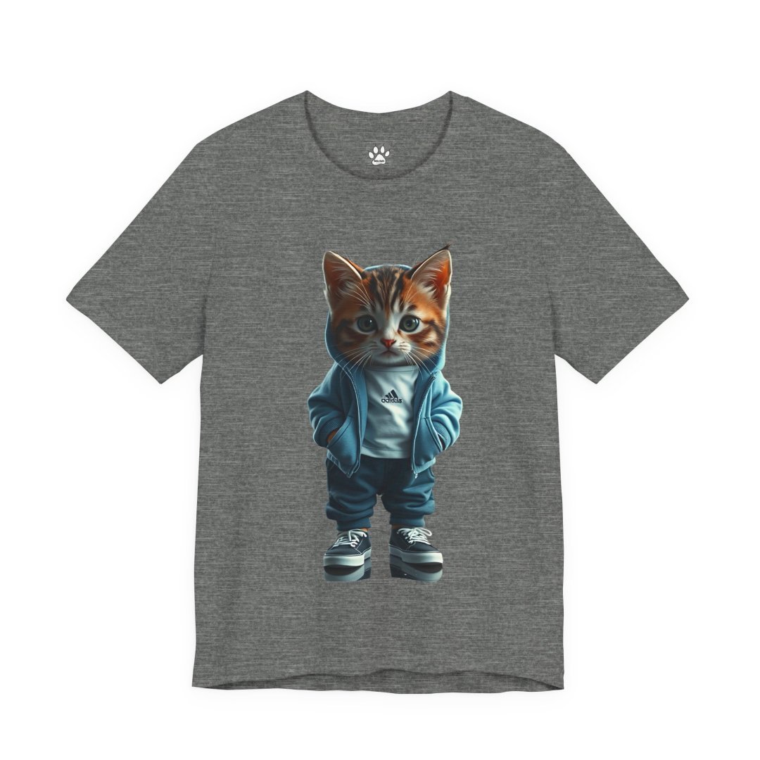
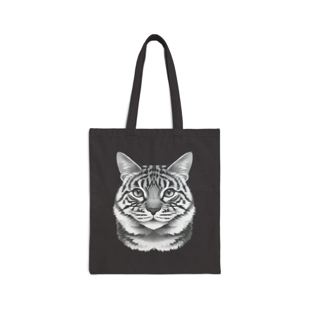
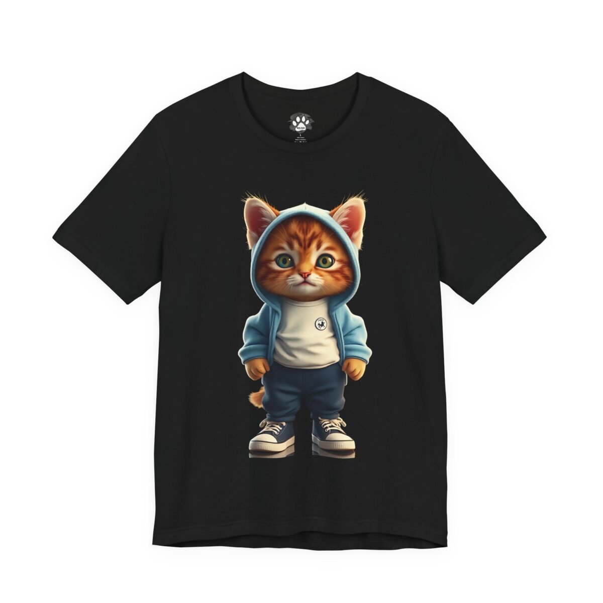
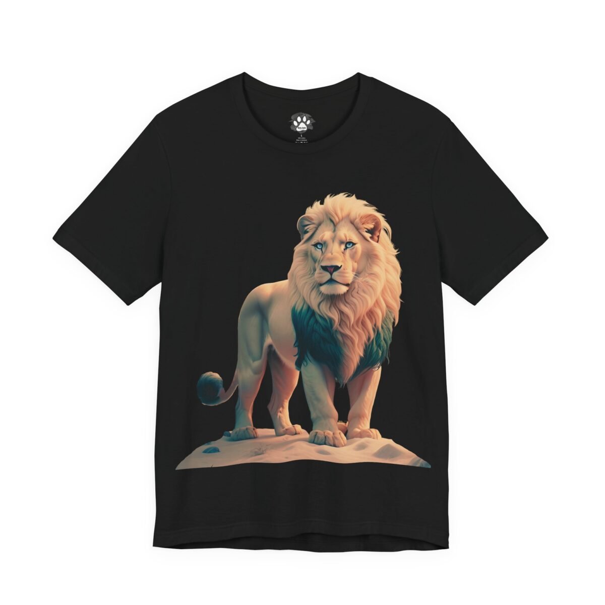
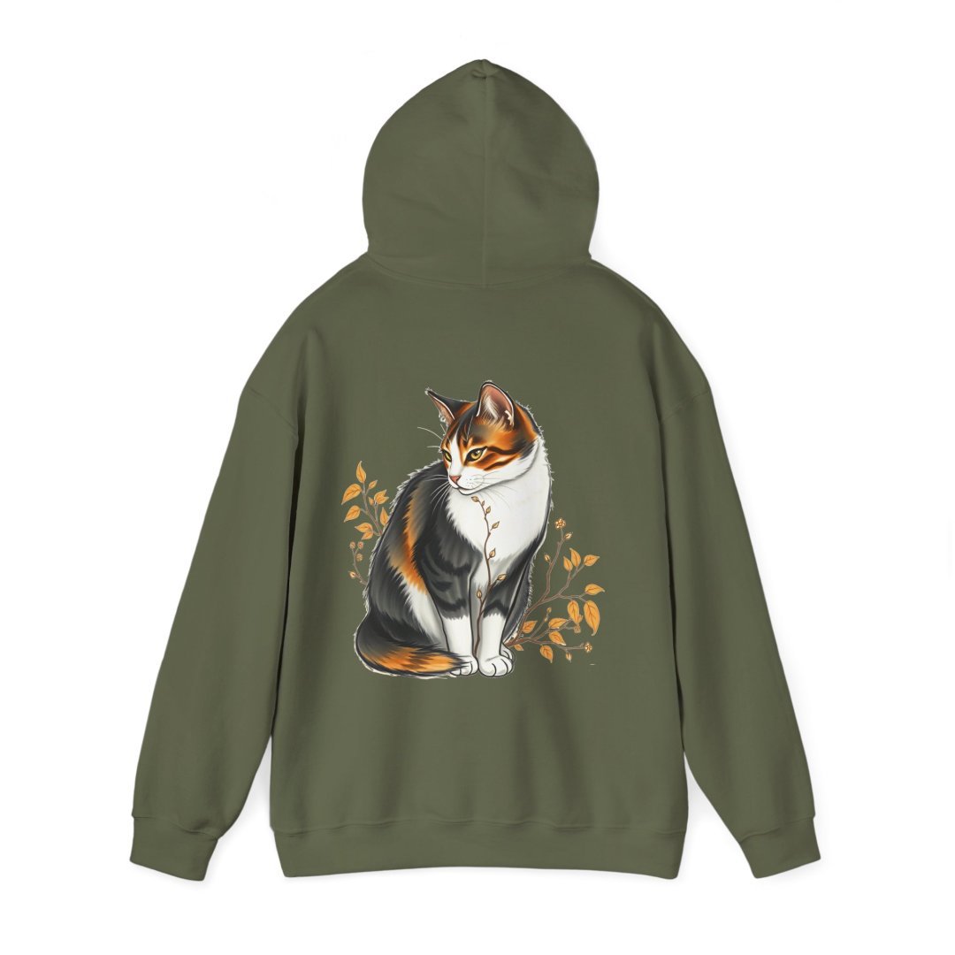
Our Adult Unisex Graphic T-shirts feature cat, funny slogan, and nature themes. The 60/30/10 rule helps you pair these tees with solid basics and smart accessories for cohesive ensembles. It also guides color choices across our collection, ensuring wardrobe ideas stay versatile and expressive. Use this framework when mixing a Bella Gatti tee with textured jackets or contrasting footwear for a ready-to-wear vibe.
1. 60%: Establishing the Dominant Color or Neutral
Selecting the main color or neutral tone
Choose a single, versatile color or a neutral base as the foundation. This color sets the mood for the whole outfit and should be easy to pair with other pieces. Think wardrobe workhorses like cream, taupe, navy, or charcoal that do not overpower the look.
When you select your dominant hue, consider how it appears on your skin and how it reads in different lighting. A cohesive base helps your graphic tees from the collection feel natural rather than loud. The goal is clarity, not distraction.
How to apply a 60% baseline with cat, funny slogan, and nature tees
Anchor the main color with a large, solid piece to apply the 60% rule. Pair a neutral tee or top with a dominant shade that covers most of the outfit. This sets a calm stage for the other elements to work from.
Let the dominant color appear in the largest item or in multiple, similarly hued pieces to maintain harmony across the look.
-
-
- Select one dominant hue for the main garment or base layer.
- Limit bold prints to secondary pieces so they don’t compete with the primary color.
- Test lighting to ensure the dominant color holds steady across scenes.
Practical steps and common pitfalls
Try a quick 3-step test on any outfit idea. First, assemble the look with a single base color, then add a secondary piece in a matching shade, and finally introduce an accent in a contrasting yet complementary tone. This helps you avoid color clashes.
Be mindful of fabric sheen. A satin finish can shift the perceived color under bright lights, while matte fabrics read truer. If you shoot in mixed lighting, photograph a sample swatch under both warm and cool light to confirm consistency.
When to adjust for different contexts
In outdoor shoots, a navy base often reads well against greenery or brick textures. In studio settings, a cream base can brighten complex features and keep graphics legible. Bella Gatti US Shop recommends testing your baseline in at least two real-world scenarios before finalizing.
2. 30%: Choosing the Secondary Color or Texture
Adding interest with a secondary color or texture
The 30% layer introduces a color or texture that complements the dominant base. This addition should contrast just enough to add depth without competing with the main hue. Use muted tones or subtle patterns that echo the base, keeping the overall look cohesive.
Texture options range from soft knits to lightweight fabric blends. If you prefer color, choose a shade near the base on the color wheel for harmony, or opt for a slightly cooler or warmer tone to add dimension. For Bella Gatti US Shop, consider pairing a soft tweed texture with a smooth satin base for a refined, premium feel.
Tips for mixing graphics and slogans without clashing
-
-
- Limit graphic density in the secondary layer to prevent visual overload.
- Match the secondary color to a less dominant area of the design to create a gentle link.
- When layering slogans, pick typography that sits in the same tonal family as the base to avoid competing with the main graphic.
- Balance bold statements with quieter textures or solid panels to maintain readability.
3. 10%: Crafting the Accent
Using accents like accessories and small embellishments
The 10% portion is where you add a deliberate, eye catching detail. Accessories and small embellishments should feel intentional, not crowded. Think a single statement piece or a handful of tiny accents that repeat a color or motif from the 60% base.
Choose accents that align with the overall mood of the outfit. A metallic bracelet, a leather belt, or a printed scarf can pull the look together without overpowering the base color. The key is restraint and alignment with the dominant palette.
Balancing bold graphics with subtle details
Bold graphics work best when tempered by quiet details. If your tee features a strong image, keep the rest of the outfit minimal. Conversely, if the accent is graphic, limit other patterns to avoid clutter.
For practical balance, place the accent where the eye naturally rests after scanning the main piece. This creates a natural flow and ensures the graphic remains the focal point rather than competing with other elements.
-
-
- Use a single metallic or matte finish for all hardware to maintain cohesion across shoes, belt, and bag.
- Anchor the 10% detail with a color drawn from the 60% tone for seamless harmony.
- Test the look in natural light; some metallics reflect differently indoors versus outdoors.
4. Color and Pattern Coordination for T-Shirts
Pairing graphic tees with solid basics
Graphic tees shine when anchored by solid basics. Use the 60/30/10 approach to create balance: let the tee anchor the 60% base while pairing it with solid bottoms or outerwear in the 30% category. Keep the remaining elements minimal so the print reads clearly in any lighting.
Choose solid tones that pick up a color from the graphic or sit adjacent on the color wheel. This creates cohesion without washing out the tee’s message or imagery.
-
-
- Limit competing patterns on the same layer to prevent visual clutter.
- Balance large prints with smaller monochrome accessories.
- Verify contrast so the graphic remains legible from a distance.
Real world tip: if your print is bold blue, pair with charcoal jeans and a navy jacket. The palette reinforces the artwork without stealing focus, a practical move you can replicate at Bella Gatti US Shop.
Guidelines for combining multiple themed prints (cat, humor, nature)
When mixing themes, treat each print as part of the same color family. Use the 60/30/10 rule to distribute emphasis so no single motif overwhelms the outfit.
Runtime checks help: test in different lighting and swap a single piece to see how the overall mood shifts. For instance, switch a bright graphic tee for a muted option to observe balance changes on camera or street wear.
-
-
- Group prints by shared color accents to create a unified look.
- Keep one print dominant and use the others as secondary accents.
- Prefer variations in scale over color when combining several motifs.
5. Achieving Cohesion Across the Bella Gatti Collection
How to build capsule outfits using 60/30/10 with themed tees
Create a core capsule by selecting tees that share a unifying color family or motif. Use the 60/30/10 rule to anchor each outfit around a dominant tee color, with supporting pieces in a complementary 30% shade and a minimal 10% accent. This approach keeps the collection feel intentional and easy to mix and match.
Organize pieces by finish and texture to add depth. Pair matte fabrics with a single glossy item to avoid visual competition. Keep the palette in a familiar range so items from different sublines still look like they belong together.
Practical combinations for daily wear and showcase looks
Daily wear emphasizes comfort and cohesion. Start with a 60% base tee in a reliable shade, add a 30% solid layer such as a cardigan or jacket, and finish with a 10% metallic or textured accessory for polish. For showcase looks, swap in a bolder 30% texture or print and reserve a single standout piece at 10% as your focal point.
-
-
- Pair a cat themed tee with neutral bottoms and a coordinating belt to ground the outfit.
- Add nature inspired layers in a close color family to maintain harmony and depth.
- Choose one printed scarf or statement shoe as the 10% focal point to draw the eye.
Expert Insight
“Colour is the first thing people notice about an outfit, and the 60-30-10 rule creates visual hierarchy that makes any look cohesive and effortlessly balanced.” , Industry Analyst
6. Styling Scenarios: From Casual to Bold
Everyday minimal looks using 60%/30%/10%
Start with a solid base that covers 60 percent of the outfit in a neutral shade such as taupe or gray. Layer a 30 percent piece in a complementary tone, then finish with a restrained 10 percent accent to keep the line clean.
Example: pair a heather gray tee with charcoal chinos. Add a muted scarf or belt in a coordinating hue to emphasize the 30 percent layer while preserving a cohesive silhouette.
-
-
- 60% base: neutral or calm shade
- 30% secondary: matching or contrasting solid
- 10% accent: a single metallic or bright detail
Statement outfits for events using the rule
For more formal moments, let the 30 percent texture or print take center stage while the 60 percent layer remains understated. Reserve the 10 percent accent as the focal pop.
Try a bold graphic tee or sequin top as the 60% anchor, a solid color or subtle texture for the 30% tier, and a striking bag or jewelry as the 10% highlight.
-
-
- 60% base: bold graphic or vivid color
- 30% supporting piece: solid color or subtle texture
- 10% focal: statement bag, jewelry, or shoe
FAQ
Can the 60/30/10 rule apply to unisex graphic tees?
Yes. Treat the tee as the dominant piece and balance it with complementary colors or textures in the rest of the outfit. The 60/30/10 framework helps keep the overall look cohesive across layers.
How strict should the percentages be in real outfits?
Use the percentages as a flexible guide. Aim for a clear 60 percent base, a distinct but not overpowering 30 percent element, and a restrained 10 percent accent. Adjust slightly for lighting, occasion, and personal style.
Does this rule apply to layering or only single-layer looks?
Both. For layering, assign each piece a role within the 60/30/10 structure to prevent clashes. For single-layer outfits, apply the same balance across color blocks or textures to achieve unity.
Expert Insight
“60-30-10 is a simple, balance-driven rule that helps you orchestrate color with confidence, ensuring a space or design reads as cohesive rather than cluttered.” , Industry Design Expert
Conclusion
Recap of how to use 60/30/10 with Bella Gatti tees
In practice, start from a Bella Gatti unisex graphic tee and establish a 60 percent base with a calm, versatile color. Build the 30 percent layer with a coordinating shade or texture, then finish with a restrained 10 percent accent that ties the look together without competing with the main graphic.
Final tips for building balanced outfits
-
- Pair graphic tees with solid basics to preserve palette clarity.
- Allow the 60/30/10 proportions to flex for lighting and occasion.
- Maintain harmony by grouping pieces within a shared color family across sublines.
- Introduce texture variety to add depth without overloading color.